
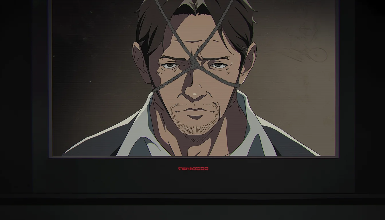
Restraint imagery is one of the oldest visual motifs in adult illustration, and one of the most frequently botched. The failures are rarely about detail. They're about staging: the viewer can't tell where anyone is, what the situation is, or what the characters want.
Rope is line work before it's anything else
Compositionally, a rope is a line that crosses a figure. Lines direct attention. That means every strand you draw is making a decision about where the viewer looks next, whether you intended it or not.
Used well, the line leads toward the face, because the face is where intent lives. Used carelessly, it fragments the figure into unreadable segments and the eye bounces without landing. The clearest test is the one we use for everything else: shrink the frame to thumbnail size and see whether the composition still points somewhere.
Colour helps or hurts here too. A rope that matches the skin tone disappears; one that fights the background pulls the whole frame apart. This is the same separation problem discussed in the piece on night palettes.
Tension is drawn, not described
Real material behaves. Rope compresses soft surfaces, follows gravity, and changes shape where it crosses itself. Fabric bunches. Skin responds. Ignore that and the drawing reads as decoration painted on top of a figure rather than something touching it.
Three specifics fix most of it: contact deformation where the line meets the body, consistent slack and gravity across the whole frame, and one clear anchor point the viewer can find. Get those and even a simple drawing reads as physical.
Consistency across a sequence matters as much as any single frame. If slack changes between shots without a reason, the scene stops feeling continuous and starts feeling assembled. Keep a reference sheet of the arrangement and check each new frame against it, the same way a crew checks a character model.
| Element | What it communicates | Failure sign |
|---|---|---|
| Line direction | Where to look | Eye bounces, never lands |
| Contact deformation | Physical reality | Rope looks painted on |
| Anchor point | Situation and geography | Viewer cannot place the scene |
| Face and posture | Intent and consent | Scene reads as ambiguous |
Intent has to read from the picture
This is the part that separates competent work from the rest. In restraint imagery the emotional situation is not self-evident, so it has to be established deliberately, and the tools are performance and continuity rather than captions.
An unhurried posture, a returned gaze, a hand resting rather than pulling, an environment that looks chosen rather than improvised — these do the work. A disclaimer placed outside the image does not, because nobody reads it and it changes nothing about what was drawn.
All of it sits on a floor that does not move: characters are fictional and unmistakably adult, no ambiguity about age, no coercion presented as romance, no real-person likeness. Those standards are written out in the control room.
Geography before detail
The most common weakness in this material is that the space makes no sense. Where is the anchor? What is the character resting against? How did the arrangement get there? If the viewer can't answer those in a second, detail elsewhere won't rescue it.
Establish geography with a wider frame or a clear silhouette before moving in close, exactly as you would for any other scene. That sequencing habit is the whole argument of the blocking guide, and it applies here more than almost anywhere.
What restraint imagery asks of an artist
Three things, in order. Draw a composition that leads somewhere. Draw material that behaves. Draw two adults whose agreement is visible in how they're posed and where they're looking.
Miss any one and the picture fails in a way more rendering can't fix. Hit all three and the technical demands turn into an advantage, because the motif gives you strong lines, clear focal control, and a built-in reason for the camera to stay close.
It's also worth keeping a short revision note for each attempt: what changed, why, and whether it improved the read at small size. Restraint imagery tempts artists into polishing surfaces when the actual problem sits two decisions earlier, and a written note is the cheapest way to catch that. Public reference material on staging and camera choices is kept at camera angles.